
Recently, an image about data went viral on Linkedin. This grouping of LEGOs, organized by Mónica Rosales Ascencio, uses these colorful bricks to remind us that data itself is not all that useful until we explain it.

That Lego meme has been going around as a way to explain why data or story alone do not tell a good data-driven story. Here’s another version from Reddit that reminds us that the story itself needs to have a hook or a reason for the reader to believe to make it meaningful.
Designing your story so that it conveys a “why” is even more important than writing the story. Who’s the intended audience? What do they want to learn? Why should they be paying attention to what you have to offer?

Where is this evident almost every day? In slides, visuals, decks, presentations, and whatever we call them these days.
What you want to do in slides
In slides that you are building to share ideas, have one idea per slide. Really. That it’s it. Everything should flow from the idea and be immediately obvious to the person you’re asking to review it.
One way to do this is to have a single thought accompanied by a beautiful image. Yes, a great image is worth a thousand words, partly because we process visual information so much faster than hearing or reading and translating words into feeling and action.
For your next slide presentation, think very mechanically at first on every slide about the following:
- What’s the point of this slide (the one thing you need them to take away
- What is your supporting evidence (yes, the #data.)
- How are you illustrating that data to prove your point?
- Now, think of a one line elevator pitch you would give if you were in the room with someone reviewing your slide. That’s probably your title.
- Next, think of any reasons the person reading the title of your slide might see something else on that slide and not feel the information is congruent. Fix those things.
Of course excellent grammar and consistent tone and voice are important. But also avoid font crimes (you only need one or two fonts and two or three point settings in most illustrations).
(A bonus pet peeve: align your objects. Left aligning, center aligning, horizontal or vertical – just make it all align to a grid. Future you will thank you.)
Need some great examples?
What you don’t want to do in slides
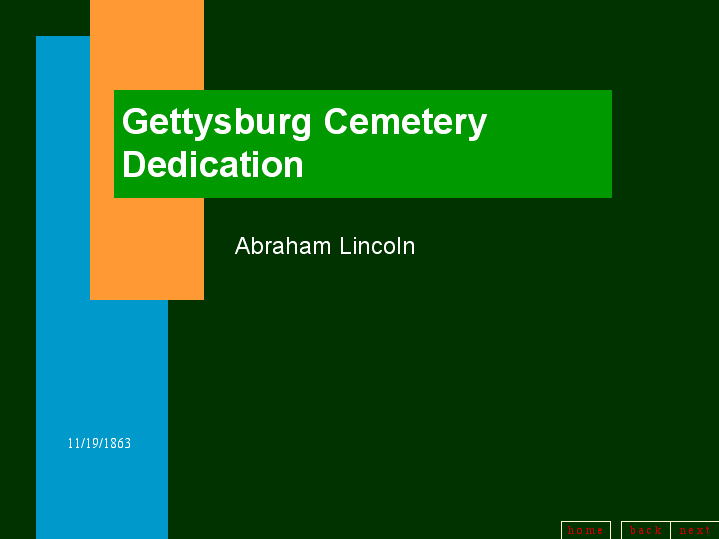
There are many negative examples of what not to do in Powerpoint. This is one of my favorites, exhibiting what Lincoln might have used to share the Gettysburg Address.
Here are a few rules to avoid in your slides.
Don’t tell everything in a single slide. Don’t provide endless detail in a slide. Don’t use a million fonts, colors, and sizes in a slide. Just the facts, presented in a clear and concise way, with one idea per slide.
Telling the story of your data
What’s the one thing you want someone to get from your slide? Does your data back that up and bolster it, while staying easy to understand?
Telling the story of your data is not always straightforward, even if the data seems like it makes sense to you at the time. Start with the idea, then point to the information.
If your data is contradictory, lead with questions that you want to resolve to move forward. Ultimately, the goal of using data in a story is to drive a decision.
What’s the takeaway? Stay simple when you make slides. Focus on one idea that you want to bring home, and align your data (or call out inconsistencies in your data) to bolster that idea.


Leave a comment